

Bouquet Colour Combinations: What Each Palette Says
Bouquet colour combinations compared: monochrome, red and white, pink, orange and the deep Signature palettes, with a chooser by occasion for Bangkok.
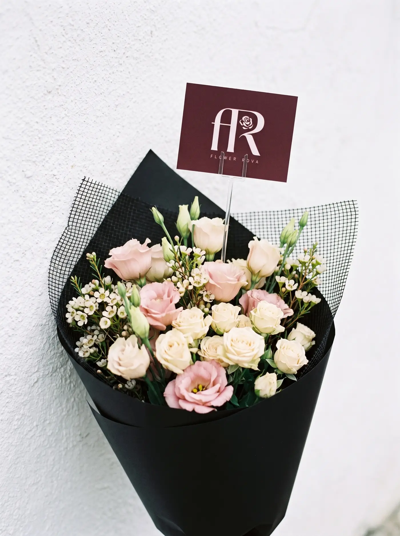
Most people choose a bouquet by the flower and hope the colours work out. A florist does it the other way round, because the palette decides how the bouquet reads before anyone looks at a petal. This guide to bouquet colour combinations covers what the main palettes signal, which ones suit a Bangkok room and a phone camera, and how to brief a mix so you get what you pictured.
If you are buying a ready-made design, it tells you why one palette fits your occasion and another does not; if you are mixing your own in the build-your-own tool, it gives you rules to apply. What a colour "says" is design judgement, not a fixed code, and we flag the few places where a source backs it up.
Bouquet colour combinations: why the mix matters more than the flower
Stand a metre back from a bouquet and the individual flowers disappear. What you see is a shape (covered in types of bouquets explained) and two or three masses of colour. That is why ordinary roses in a considered palette look more expensive than rare flowers in a muddle.
Three properties decide whether flower colour combinations work, and they apply to roses, carnations and dahlias alike.
Contrast. Red against white is high contrast: the eye jumps between them. Pink against white-pink is low contrast: the eye slides. High contrast reads as graphic and decisive, low contrast as soft and cohesive.
Temperature. Orange, coral and peach are warm and sit forward in a room. Blush and cream are neutral. Purple, burgundy and anything with blue in it sit back. A warm bouquet on a pale desk draws attention; a cool one disappears into the room, which is sometimes the point.
Depth. One flat colour looks like a block. The same colour in three tones looks alive. Our pink rose range is graded across several tones rather than one pink, which is why it rarely looks like a printed sticker.
The research on colour is thinner than greeting cards suggest. One 2021 study with 50 participants compared single colours rather than combinations, and yellow and red flowers beat white on self-rated relaxation, cheerfulness and comfort. A separate experiment with 158 participants, using pictures of flowers, found that colour had a bigger effect on stress-recovery measures than petal type. Both were small, neither used a bouquet on a kitchen counter, and neither makes flowers a treatment for anything. They support one modest point: colour is part of what a flower does in a room, not decoration on top.
If you only want the single-colour question, we cover it in Red or Pink Roses? What Each Colour Actually Says. This guide starts where that one stops: what happens when colours share a bouquet.
Monochrome: one colour, many tones
A monochrome bouquet is one colour family in several tones: three pinks, or red from crimson to near-black. It is the easiest palette to get right and the hardest to make interesting, because with no contrast to do the work, variation has to come from tone and texture.
It photographs cleanly, because the camera is not resolving competing hues, and in a home full of colour one clear family reads as a single note against the noise.
It fails when it is flat. The lightest and darkest tones should sit at least two steps apart. The Signature design The Sugar Pink is built on this idea: spray carnation graded across three pinks, with limonium to fill. The grading is what stops it reading as one colour. A five-stem posy has no room for grading; from about fifteen stems, tones can separate.
With roses you have four honest families, each a range rather than a shade:
- Red roses: deep crimson, tight heads, the most formal of the four.
- Pink: soft blush through to hot pink inside one bunch.
- White-pink: ivory and cream cut with soft pink, about two whites to every pink.
- Orange roses: coral, peach and apricot, with yellow when the farms cut it.
If you want a monochrome bouquet at a size that shows the grading, 20 roses are ฿3,299 delivered, the point where one colour starts to look generous from across a room.
Red and white, red and pink: the classic pairs and what they signal
Red and white
Red against white is graphic: a stripe, a bridal ribbon. It is formal and slightly ceremonial, which is why it turns up at weddings, anniversaries and openings more than on a casual Tuesday.
On red and white roses meaning, the Royal Horticultural Society's school resource on the meaning of flowers lists red as eternal love, white as truth and innocence, and the pair together as unity. That is a pleasant thing to put on a card, but it is a tradition you can borrow, not a code the recipient has agreed to. The RHS also notes that encoded bouquets were a fashion among lovers in Britain and America from the 1820s to the 1880s. Treat it as the parlour game it was.
Our white-pink mix is not pure white, so red with white-pink is a softer version of the pair: crimson against ivory with a blush. That is the one we suggest if pure red and white feels too stark.
Red and pink
Red and pink together are warmer and less formal. The contrast is low, so the effect is a richer pink bouquet rather than a two-colour statement. It is the gentlest way to introduce red to someone who dislikes loud romance.
What to avoid
Do not mix red and orange half and half. They sit close enough on the colour wheel to fight, and it looks like a mistake rather than a choice. If you want warm and red, use a clear base with one small, definite accent.
A rule for mixed rose colours in one bouquet: give the dominant colour about two-thirds and let the second be the minority. Equal halves look undecided.
Pink and white-pink: the gentle palette
A pink and white bouquet is the quietest combination a rose can make, and the one we suggest when you are unsure. It is low contrast, warm-neutral and safe at a birthday, a thank-you or a new home, and it can suit a hospital visit where the ward allows flowers.
Soft palettes lower the stakes. Red says something; blush and ivory says it was nice to think of you, which suits a new relationship, a colleague or a client.
There is a little evidence that pink roses are pleasant to look at. In a 2014 study of 31 male office workers in Tokyo, viewing 30 unscented pink roses for four minutes produced higher high-frequency heart-rate variability and more "comfortable" and "relaxed" feelings than no flowers. One small group, one setting: a data point, not a promise, but a fair argument for a desk bouquet.
Two ways to build it
Pink with white-pink. The white-pink mix already contains pink, so adding pink roses deepens the blush without introducing a new colour. It reads as one graded bouquet.
Pink with a pale neutral. Spray roses, lisianthus or wax flower in cream add texture without colour. The Ivory Claret pairs ivory spray roses with a little claret, and The Sugar Pink stays entirely in pink.
It also survives a client's reception desk: in a Sathorn tower lobby of glass, grey stone and strip lighting, soft pink and white hold up where a saturated palette can look pasted on.
A worked example
Say a friend is moving into a condo in Ari, has sent you the new address, and you will not see the place first. You do not know the sofa, the walls or whether there is a vase. That is what the gentle palette is for.
You choose 20 white-pink roses at ฿3,299, order before the 9 pm same-day cut-off, and ask for the juristic office handover with a photo, as in our guide to sending flowers to a Bangkok condo. The card reads: "Moved in? The kettle is on me when the boxes are gone."
Orange with anything: warmth without romance
Orange is the most underrated colour in a florist's range: warm, energetic, and not romantic. That makes it the colour for congratulations, birthdays, openings and thank-yous where you want enthusiasm without courtship. The RHS's list of traditional rose meanings gives orange roses the label "energy", which matches how most people react.
Orange is a bridge colour. It pairs with cream and white-pink for a soft peach palette, with pink for a warm sunset, with burgundy for something dramatic. Clashing is hard because our orange mix already runs from coral through peach to apricot and contains its own gradient.
The orange and pink bouquet
An orange and pink bouquet is the combination people hesitate over and then love. Coral and blush are close neighbours; hot pink and deep orange are not. The test is lightness. Pale peach with pale pink looks like sorbet. Saturated orange with saturated pink looks like a market stall, which suits a birthday and not a boardroom. If one colour is light, keep the other light; if both are saturated, add cream or foliage so the eye can rest.
The Terracotta is our Signature design for this: orange and peach roses with velvet celosia pushed low for texture, listed for congratulations, birthdays and grand openings. At rose-only scale, 10 orange roses are ฿2,399 and brighten a desk without taking it over.
Orange has a Thai echo. Phuang malai garlands are commonly made of jasmine, marigolds and roses, so white, golden orange and rose already sit together in a form most people in Bangkok recognise. A white-pink and orange bouquet is not a garland, but it shares the palette.
Deep and dark: the Signature palettes explained
The deep palettes are the opposite of the gentle ones: low-key, high drama, and more demanding of the room. Each design solves the same problem, making dark flowers look luxurious rather than funereal.
The Oxblood Affair carries the badge "Deep colour palette" and is the darkest thing we make: café-au-lait dahlias and oxblood peonies against copper beech, built low and wide so it reads as one mass of colour rather than a spray. The paler dahlias do structural work, stopping the oxblood collapsing into a single dark lump. It is listed for anniversaries, romance and apologies, and the card should be short, because the bouquet already says a lot.
The Bruise is deep purple into burgundy: purple lisianthus and burgundy roses pushed together until the join is hard to find. It is a gradient, not a contrast. Purple sits cooler, burgundy warmer, and the eye settles where they meet. It is listed for anniversaries, apologies and just-because.
The Dusk Cut works differently. It is a seasonal composition of about 38 stems built around the week's best flowers (our month-by-month guide to seasonal flowers in Thailand shows what that is likely to mean), and the page asks you to discuss your palette with the team first. If you want depth but do not know which flowers, brief by colour. Our guide to the florist's choice bouquet explains how to write that brief.
When dark palettes go wrong
Dark palettes need three things.
- Light on them. In a dim condo living room a dark bouquet becomes a silhouette. Put it near a window or a lamp.
- A pale surface behind or under it. A dark bouquet on a dark console disappears.
- An occasion that wants weight. An anniversary, a reconciliation, a dinner for two. At a children's birthday it looks like a mistake.
They are poor choices for most corporate and hospital settings, where lighter palettes are the usual brief.
A worked example
Say you and your partner have been together four years, the month has been rough, and a cheerful peach bouquet would feel like a change of subject. You choose The Oxblood Affair or The Bruise, and confirm the delivery date and handover in chat. The card reads: "Rough month. Dinner is booked and I am listening." If the relationship is newer, step back to the gentle palette. A deep palette on date two is a lot.
Matching colour to room, skin tone and photos
A bouquet lives in a place and in photos. Matching both is the cheapest way to make it look right.
The room
Start with the largest surface, the sofa, wall or floor. Match it for calm or sit opposite it for a focal point: pale room with a pale bouquet is quiet, pale room with a deep bouquet is a statement.
Then check the light. In a bright condo with full-height windows, pastels wash out and saturated colours hold. In warm lamplight whites go cream and pinks drift toward orange. The Tide Line, white with steel blue, is described on its page as the coolest palette we tie, for rooms with a lot of grey or glass.
Keeping the palette clean
A palette only looks like the photo if the water and vase are clean. The RHS advises stripping leaves below the waterline so they do not rot and re-cutting stems with a sharp knife. A Cornell study found that bacterial diversity in vase water and on stems rose over seven days, and that bacterial blockage of the stem harms water balance and flower quality. In practice: wash the vase with soap first, change the water, and keep leaves out of it. Our guide to how to clean a flower vase has the steps.
Skin tone
Bouquets get held beside a face in photos. These are design judgements, not science.
- Warm, golden undertones tend to suit peach, coral, cream and warm red.
- Cool, pink undertones tend to suit blush, cool pink, white and burgundy.
- When unsure, white-pink and cream rarely look wrong.
Photos
Most bouquets are photographed within minutes of arriving, often in a corridor with strip lighting. Shoot near a window rather than under a ceiling light, because warm bulbs push pink toward orange, and use a plain pale wall behind. Our Signature look is a hand-tied bouquet in a matte black wrap with black mesh, which frames any palette and makes saturated colours look deeper. Judge a bouquet by colour, count and construction rather than adjectives, as we argue in what premium flowers actually means.
Cultural notes for Thailand: colours, days and occasions
We will not give you a table of Thai colour rules, because we know of no single one and the sources we trust do not offer one. What we can do is point to what is documented and say where the honest answer is "ask".
What is documented
Mother's Day. Thai Mother's Day is 12 August, set in 1976 for Queen Sirikit's birthday, and jasmine is its flower, symbolising purity and enduring love. Jasmine is white, so a white or white-pink palette fits naturally. Our guide to Thai Mother's Day flowers and jasmine explains why we still treat colour as a preference to ask about.
Garlands. Phuang malai are offered at shrines and presented to elders at Songkran, and Thai PBS World describes them as devotional and ceremonial items representing love, wealth, luck, peace and stability. A white, orange and rose palette is a familiar one for an older relative at Songkran.
Valentine's Day. At Pak Khlong Talat, the Bangkok Post reports that rose bouquets are the best seller on Valentine's Day, and Thai PBS World describes the market that week with roses in abundance. Red is the default. A pink or white-pink palette stands out precisely because it is not. Timing is in our Valentine's Day guide.
As a guest. The Cultural Atlas notes that bringing a gift to a Thai hostess is not necessary but appreciated, with flowers among the appropriate choices. For a housewarming or dinner at someone's home, a soft palette is the low-risk choice.
Where the honest answer is "ask"
Funerals and sympathy. White, cream or muted tones can suit a restrained brief, but they are not a universal requirement. Follow the family, and read phuang and funeral flowers in Thailand first.
Personal and family beliefs. Any colour rule you have heard from a relative or a website is a personal belief, not a national one; generation, region and religion all change the answer. Ask someone close to the recipient.
Hospitals and venues. Colour matters less than whether flowers are allowed at all; rules are set ward by ward, so ask before you order.
A palette chooser by occasion
Use this table as a starting point, then adjust for the person.
| Occasion | Palette to start with | Why it works | Where to look |
|---|---|---|---|
| Anniversary, years together | Deep red, or a deep Signature palette | Formal, weighty | Red roses, The Oxblood Affair, The Bruise |
| Date two or three | Pink with white-pink | Warm, low pressure, easy to accept | Pink, white-pink |
| Apology | Deep palette, short card | Matches the mood, avoids cheer | The Bruise, The Oxblood Affair |
| Birthday, friend | Orange and pink | Energetic, no romantic signal | Orange, The Sugar Pink |
| Congratulations | Orange, peach, coral | Reads as celebration | The Terracotta |
| Grand opening, office | White-pink or orange | Lobby-friendly, photographs cleanly | White-pink, orange |
| New home | White-pink, soft pink | Fits an unseen room | White-pink |
| Thank you, colleague | Pink or white-pink | Warm without personal weight | Pink, The Ivory Claret |
| Hospital visit | Ask the ward first | Rules vary | Ask before ordering |
| Sympathy | Follow the family | Appropriateness beats colour | Ask the family |
| Not sure | Florist's choice with a colour direction | You set the palette, we pick the flowers | The Dusk Cut |
One thing overrides the table: if the recipient has a favourite colour, send that.
When not to experiment
At a funeral, on a hospital ward, or as a first message to someone you barely know, choose one gentle family and keep the palette quiet. A bold palette is a statement, and statements need an audience that has asked for one.
A brief that works
When you message us, give the occasion, the recipient's likely taste, the setting, and one main colour with one accent: "Anniversary, she likes dark colours, it will sit on a white console in Thonglor. Mostly burgundy with a little cream." Same-day delivery is for orders by 9 pm up to 40 roses, with longer notice for larger sizes, as the delivery page sets out. Settle the palette first and the timing second. If you want the other decisions first, our guide to how to choose a bouquet covers size, occasion and budget.
Frequently asked questions
What are the best bouquet colour combinations for a first gift?
Pink with white-pink is the safest. It is low contrast, warm and rarely misread. For more energy without romance, add orange. Avoid deep reds and dark palettes on a first gift unless the recipient has said they like them, because those carry more weight than a first gesture needs.
What do red and white roses mean together?
The traditional reading recorded by the Royal Horticultural Society is unity, with red standing for eternal love and white for truth and innocence. It is a Victorian convention rather than a rule everyone shares. Use it in the card if you like, but do not assume the recipient already knows the code; say what you mean in plain words as well.
Can you mix rose colours in one bouquet?
Yes. Give the dominant colour about two-thirds and the second a minority share, because equal halves look undecided. Tell us the split you want when you order by chat, and we will confirm what can be tied and at what stem count before the order is final.
Does an orange and pink bouquet work?
It works when the two colours share a lightness. Pale peach with pale pink looks soft; saturated orange with saturated pink looks bold. Add cream or foliage as a rest for the eye. Coral and blush are close neighbours, so they are the easiest pairing to get right.
Are there Thai colour rules for flowers?
We know of no single national rule and will not invent one. Some traditions are documented, such as jasmine for Thai Mother's Day and white, orange and rose garlands, but personal and family beliefs vary. Ask someone close to the recipient, and follow the family's wishes for funerals.
How do I keep a pale bouquet looking clean?
Start with a washed vase, strip leaves below the waterline and change the water regularly. Cloudy water shows most on pale bouquets, and a deep palette hides it for longer. If you are unsure which palette suits a home, send us the brief and we will suggest one.